
More Than a Name: How Specialized Redefined Their Business Through Rebranding
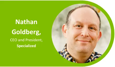 When Nathan Goldberg (left) joined Specialized over 20 years ago, the company was called Specialized Office Systems, or SOS for short. He immediately recognized the strategic need to find a new name for their business, but it would be a long road ahead before the company officially rebranded. Along the way, there was a progressive evolution as the business searched for its new identity.
“When I joined the company, everybody called us SOS,” Goldberg reflects. “And I thought ‘What can we do with SOS?’ If you Google SOS, it’s the international sign for distress. You can't copyright it, can't trademark it — you can't own the domain. It's really a terrible name. Around 10-15 years ago, we started referring to ourselves as Specialized. Even though we didn’t say the whole name, we were still Specialized Office Systems. All our communications and collateral still had the full name.”
Fast forward to 2022, Goldberg — now CEO and president — and the Specialized team linked up with a consulting group to officially rebrand the company. They searched for a name and brand that would honor their 37 years of service and tell new customers what they’re all about. Initially searching for an entirely new brand identity, they found the right fit close to the source.
“We came up with a fantastic new name. It was awesome. The issue that I had with it was our current customers would have no idea who we are. So, we went back to the drawing board, and we said ‘Well, let's just keep it simple.’ It used to be Specialized Office Systems, so what if we drop office systems, change the branding and call that good enough.”
The informal nickname became official, and the Specialized team dove into creative brainstorming. They wanted their updated look and feel to reflect the markets they served and their friendly approach to doing business.
“For me, it's really about how the logo and branding makes me feel. We wanted something bright and sunny. We're in Arizona and Southern California — we have a lot of sun in our market. I also wanted to focus on the brand representing who we are as a company. We're fun, we're fresh, we're sunny and we have a great personality. I really wanted the brand to emulate those qualities, so as soon as I saw the new branding, I knew it was great.”
Functionality was key in finalizing their new look. The team leveraged their expertise as print and promo professionals to find a balance between fun and functional. Goldberg held conversations with staff and production partners to inform the consultant of their branding requirements.
“I always recommend having your conversation with your partners — those who will reproduce the logo. We started making a list of all the products that needed to be refreshed. So when the creative team came back to us with concepts, we could look at them and say ‘We like the concept, but it can't be printed’ or ‘We like the concept, but it can't be embroidered.’ And so we narrowed it down and further refined the ideas.”
A rebrand isn’t just a name, color palette and new logo; it presents an opportunity to spark new conversations with repeat and potential customers. A year later, Goldberg says they’re still seeing the impact of this new start.
“We had a really good year last year. I don't know if you can attribute that to the new logo and brand, but when we're meeting with customers and prospects I think we're getting opportunities we wouldn't have normally. We're getting feedback from some of our long-time customers saying ‘Hey, I love the new logo, I love the new brand, I love the new colors,’ so that has been really positive. I don't know if they're spending any more money with us, but one of the goals of the rebrand is to remain relevant and fresh. I want to be able to talk to customers about more strategic alternatives we offer without them asking if we sell office supplies, because we have ‘office systems’ in the name. That hasn't happened since we've rebranded.”
By Bethany Larrañaga